Enhancing Reporting Tools for District Adminstrators
To help admins easily identify and merge duplicate profiles, reducing redundancy and ensuring data accuracy with an intuitive and efficient workflow.
My Team
1 Product Designer
6 Developers
My Role
Product Designer
Project Lead
Tools
Miro
Adobe XD
Overview
District administrators rely on reporting tools to make decisions around compliance, performance, and governance. However, the existing cold fusion–based report manager limited their ability to quickly locate and analyze data. The interface was outdated, unintuitive, and lacked critical filtering capabilities that aligned with administrators’ operational needs. As the Product Designer, I led the redesign of the Report Manager’s main screen, focusing on enhancing the experience and introducing more flexible filtering.
Problem
District administrators faced three main challenges with the existing system:
Limited filtering: No governance or school-type filters, making it difficult to narrow down relevant data.
Inefficient workflows: Administrators had to navigate multiple reports manually to find what they needed.
Outdated technology: A Cold Fusion–based interface created usability issues and prevented scalability.
The result: slow reporting, inconsistent data analysis, and frustration for administrators tasked with governance and compliance responsibilities.
Goals
The primary goal of the Report Manager redesign was to enhance the experience and better support the complex reporting needs of district administrators. We set out to improve usability by moving away from the outdated Cold Fusion interface to a scalable Angular framework, while also enhancing the discoverability of data through persistent core filters such as academic year, district-wide view, schools, student status, governance, and groups. At the same time, the redesign aimed to provide greater flexibility without adding unnecessary complexity by introducing report-specific and advanced filters that only appear when relevant. To increase efficiency, we enabled users to pin favorite filters for quick access, and to build confidence in the reporting process, we added a Preview Report option that allowed administrators to validate results before running a full report. Together, these goals were designed to address immediate usability challenges, streamline compliance-driven workflows, and establish a foundation for a more scalable and intuitive reporting system moving forward.
Impact
While quantitative outcomes depend on post-launch data, early feedback and testing highlighted:
Faster report generation workflows — admins could filter to relevant data in fewer steps.
Higher accuracy and confidence — preview reduced the risk of wasted time running irrelevant reports.
Improved adoption of new filters, especially governance, which directly supported compliance reporting.
By enhancing the interface and aligning it with administrators’ goals, this project set the foundation for a scalable reporting system that could grow with future needs.
Research
To ground the redesign in real user needs, I began with stakeholder and administrator interviews to uncover the biggest challenges in navigating and generating reports. A recurring theme was the lack of flexibility: users often needed to slice data by governance type or school category to meet compliance and oversight requirements, but the current system simply didn’t support it. I also conducted a workflow audit of the existing Cold Fusion interface to identify pain points in efficiency and discoverability, which revealed that administrators were spending unnecessary time searching across multiple reports to find relevant data. To complement this, I benchmarked competitor platforms and internal reporting tools to understand best practices in filtering and preview flows. Across all inputs, one insight stood out: administrators needed a filtering system that could serve both quick, everyday lookups and more advanced, compliance-driven deep dives. This research shaped the foundation of the redesign by validating the need for persistent core filters, while also justifying the introduction of dynamic advanced filters that could adapt to the complexity of each report type.
Design
To create an intuitive experience, I created wireframes and prototypes that emphasized simplicity and clarity. Usability testing played a vital role, with admin feedback leading to improvements in clarity, navigation, and functionality.
Matching rules were also implemented to identify duplicates effectively:
Same email address
Same phone number
Same first name and address
Same last name and date of birth
Exclusions, such as proactive detection during profile creation or editing, and duplicate management of organization profiles, were deferred to maintain a manageable MVP scope.
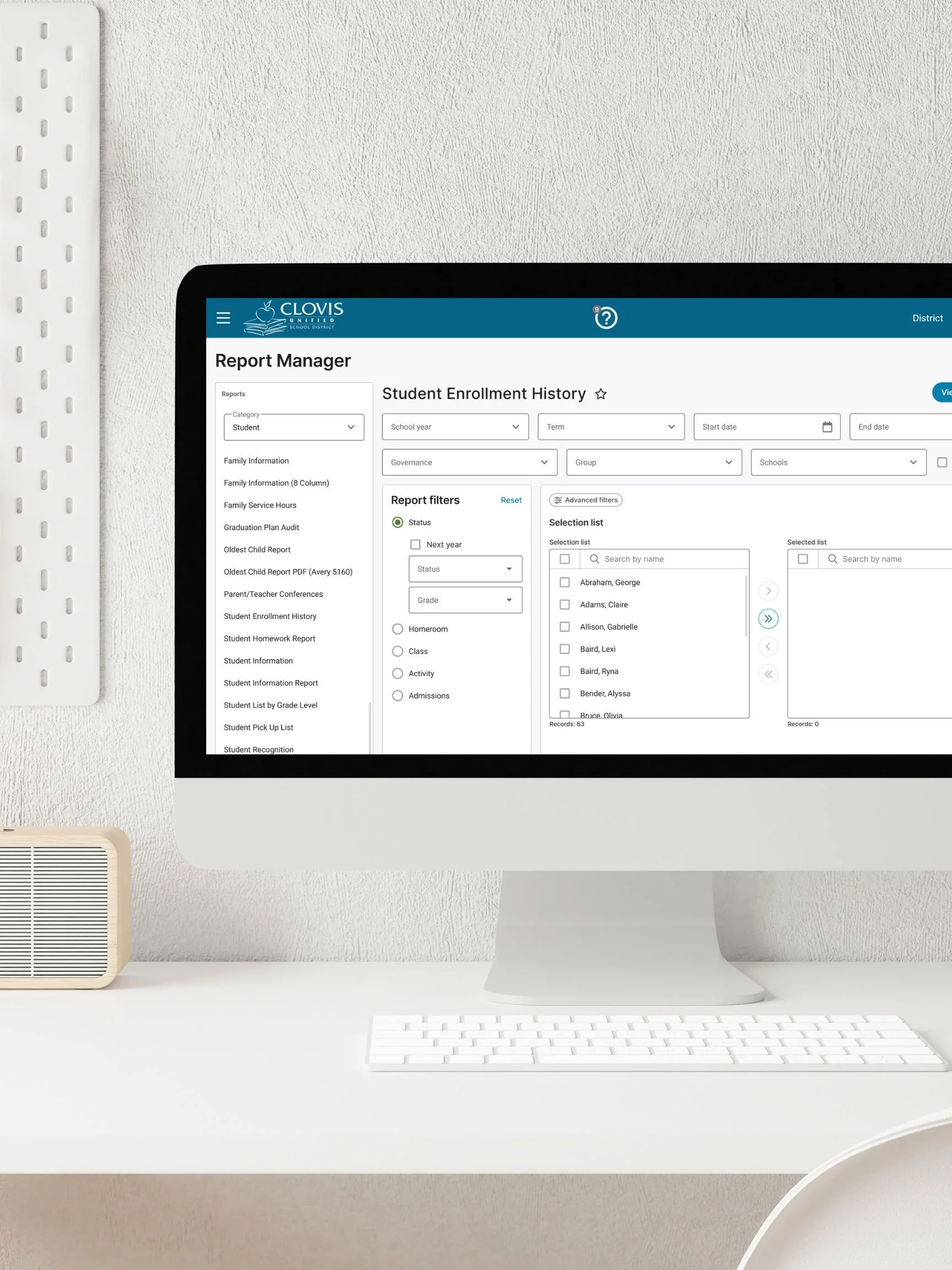
Core Filters
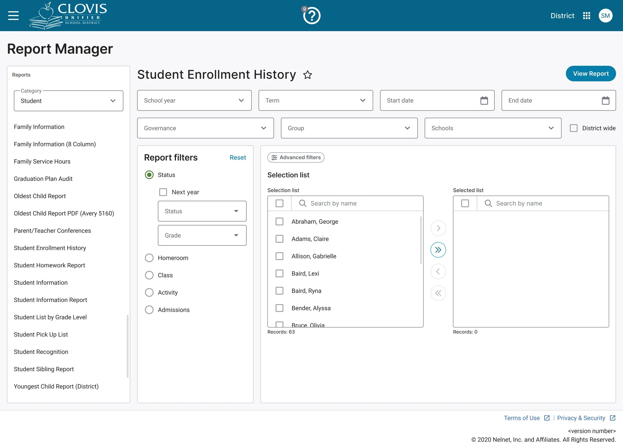
In the current Report Manager, when users select a report, the filters display below the report selection boxes, which can feel cluttered and unintuitive. The redesign aimed to make filter selection clearer, more structured, and easier to navigate.
To achieve this, I introduced a core filter section for filters shared across report types, ensuring consistency and reducing cognitive load. I then created a report-specific filter section to distinguish unique filters for each report type. Finally, I added a selection list section where users can easily choose the specific students or staff they want included in the report.
The result is a cleaner, more organized layout that supports users in quickly applying the right filters and generating the report they need with minimal friction.
Advanced Filters
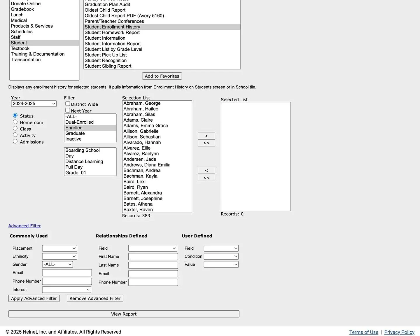
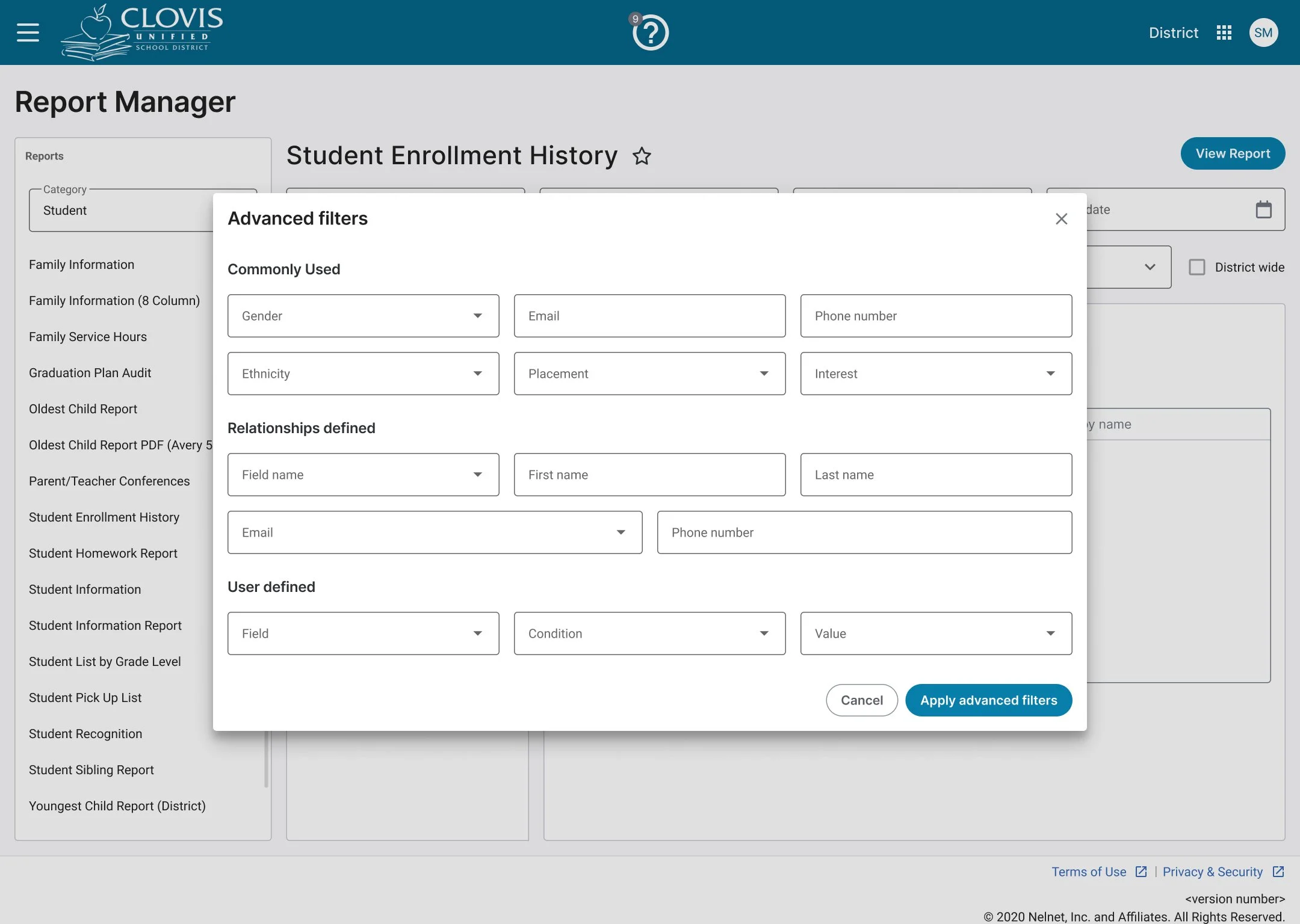
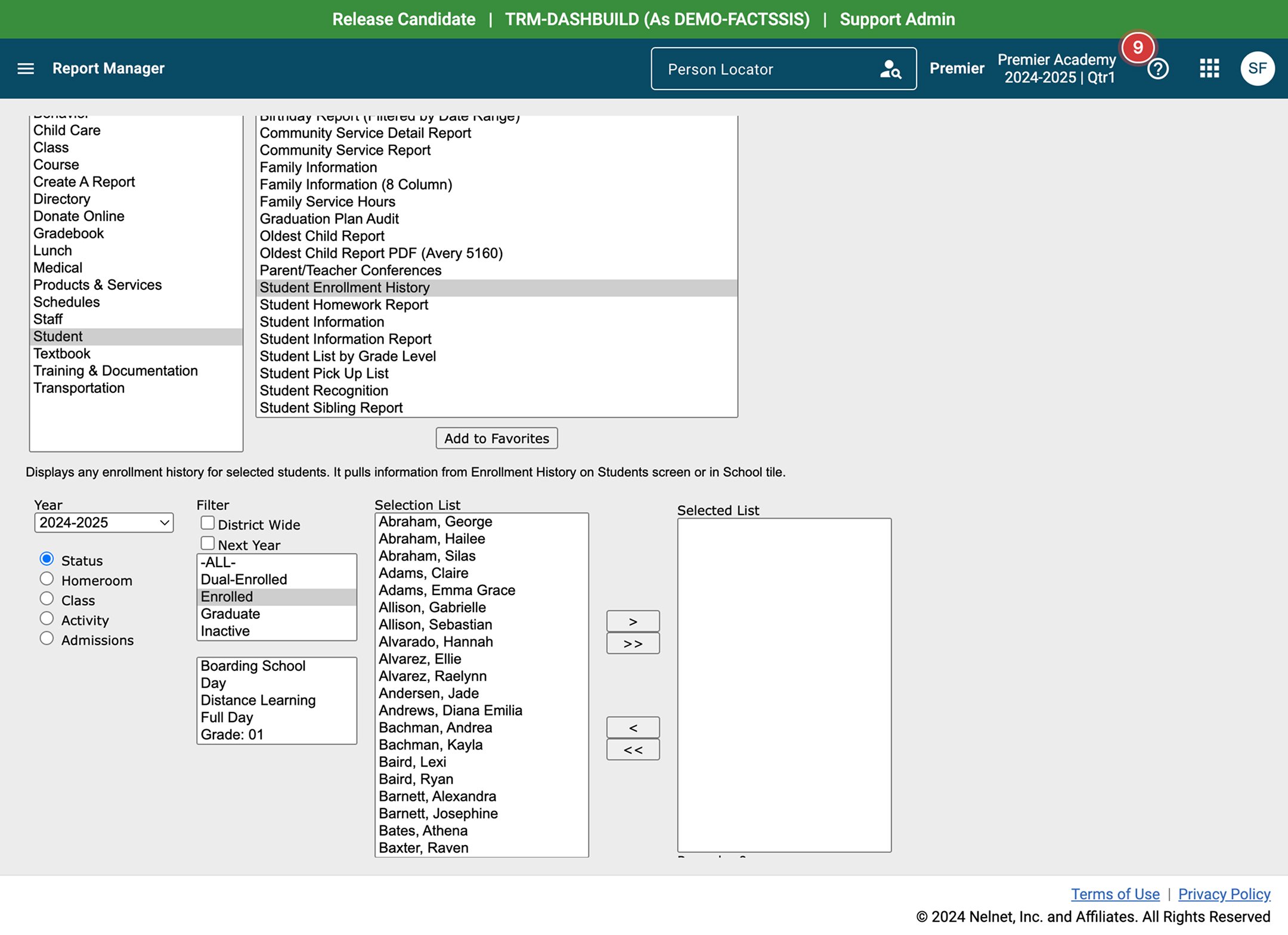
In the existing report manager, the advanced filter was tucked away as a subtle hyperlink at the bottom of the page. Its low visibility and unclear affordance made it hard for users to discover, and even when they did, its behavior wasn’t intuitive. This caused friction in a key workflow, limiting users’ control over how reports were displayed.
For the redesign, I transformed the advanced filter into a secondary button, following established interaction patterns to communicate clickability. Clicking the button opens a modal dedicated to advanced filtering, giving users a focused and structured space to set their criteria. This change enhances discoverability, reduces cognitive load, and delivers a more consistent and accessible filtering experience across the product.
Solution
The redesigned Report Manager delivered:
Modern, Angular-based interface for performance and scalability.
Robust filtering capabilities including governance, school type, and groups.
Pinned favorites for efficiency.
Context-aware filters that adapt to the selected report.
Preview mode to validate results before running.
Smooth back navigation that preserves filter state.
Next Steps
To build on this success, future iterations will focus on:
Enhancing the accuracy of detection algorithms
Introducing bulk merging capabilities for greater efficiency
Adding proactive alerts to identify duplicates during profile creation or editing
Gathering user feedback to continuously refine functionality and meet evolving needs
These improvements will ensure the feature remains relevant, impactful, and aligned with user expectations.